

It is incredible the power that a colour/ shade/refraction of light has on culture, composure and communities around the world, and over centuries. Think purple and royalty, the show of breast cancer support and the colour pink, Goth teens in black the ‘80s, and the role of white in combat and conflict. As individuals, our visceral and often subconscious reaction to colours can have a dramatic effect on our emotions and actions, simply by being.
Every year as colour authorities including Pantone and paint company Benjamin Moore comb the globe, they sift through a cornucopia of cultural, artistic and environmental influences, all in the pursuit to define the upcoming year through the language of colour. A shade that remarkably renders the pulse of a moment in time.

For 2023, post-pandemic and at the beginning of a reentry into life before lockdowns, both colour companies landed on a red-based shade, a complete about-face after years of swimming in a sea of comforting, low-key neutrals.
When it comes to interiors, Canadians tend to prefer neutral spaces over bright and colourful ones. The land of greige and soft, soothing tones where we cocoon comfortably during winter months, reached its pinnacle during the past three years, and the resurgence of colour is a welcome departure. But why?
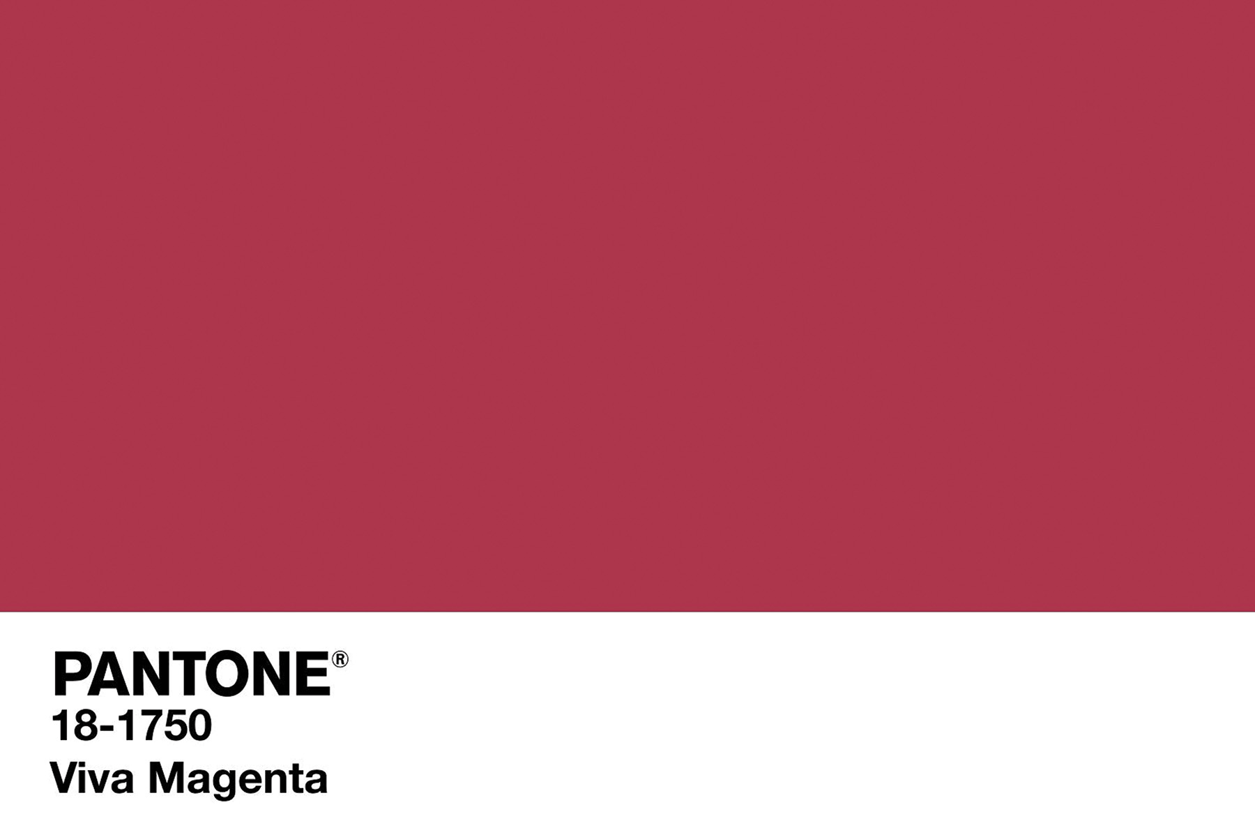
Leatrice Eiseman, Executive Director at Pantone Color Institute explains why we are seeing red in 2023: “We are living in a very unconventional time. It is clear our experience with COVID has forced us to make changes, transforming our lifestyle and sense of self as well as influencing the way well-being, priorities and identity are thought about. Refusing to step back to the life we once considered normal, we are instead embracing this opportunity to write a new narrative for ourselves, establishing a new vision.” The Pantone colour Viva Magenta, said to vibrate with vim and vigour, is a shade rooted in nature demonstrating a new signal of strength. Inevitably, it is a colour that highlights a change of perspective; “spotlighting our need to feel empowered and infusing us with strength so that we can courageously and fearlessly embrace a new pathway with confidence.”
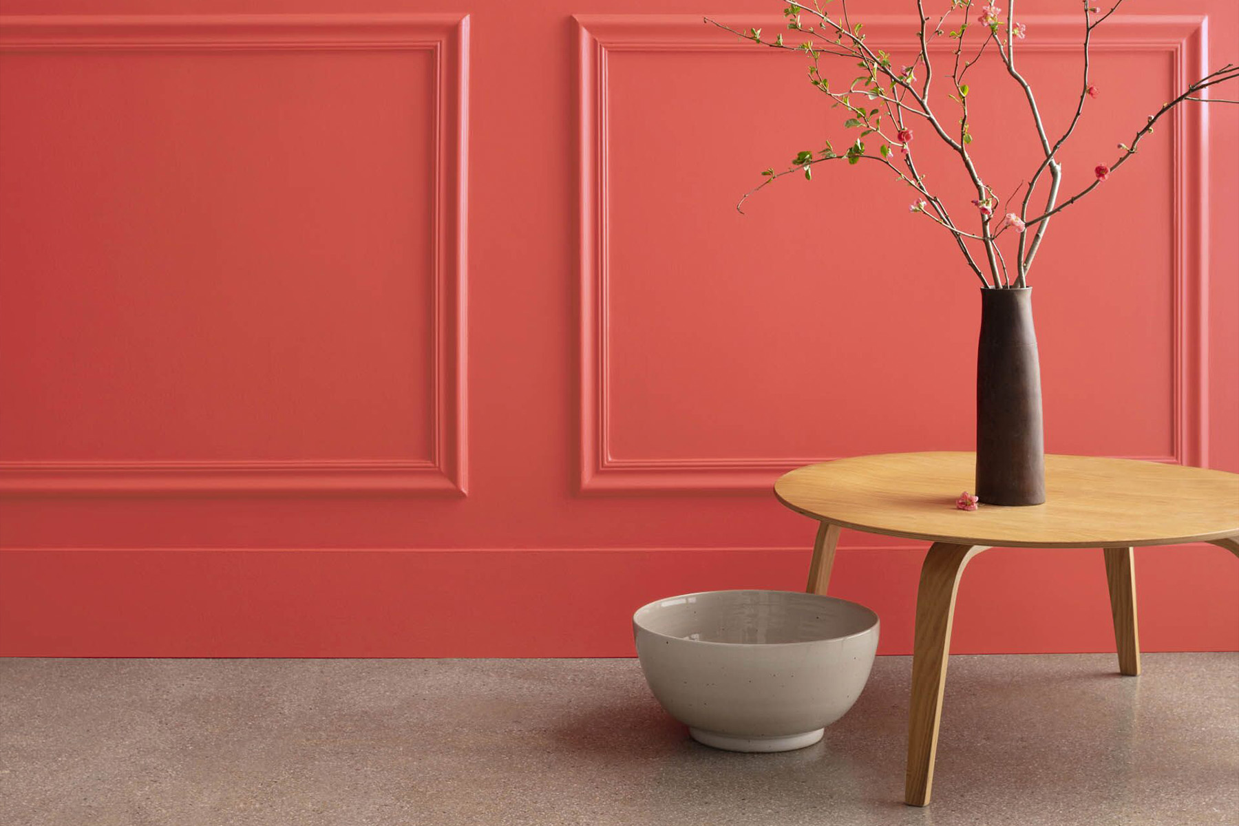
Sharon Grech, Colour & Design spokesperson at Benjamin Moore, echoes Eiseman’s observations and corroborates the fiery red-based colour choice for 2023, which speaks to this major shift in the global zeitgeist. “We are certainly not living in simple, carefree-times, however, we picked up on the undercurrent of optimism out there, the strong yearning for playfulness and joy and set out to explore that through the lens of paint and colour and home.” says Eiseman. “Red is a very strong, symbolic colour. We were intentional with our choice of Raspberry Blush for its bold, vivacious personality that is not aggressive. The orange and pink side of Raspberry Blush though, highlights the playful side of this red bringing a sense of delight.”
In fact, with so much uncertainty in the world beyond the pandemic-induced awakenings, the need to inject joy (with the help of colour) scored high on the radar. “Raspberry Blush spurs feelings of happiness and joy. On a wall, a ceiling, a door or a piece of furniture, it brings energy to a space and is likely to bring a smile to your face in a way that greige just isn’t capable of. It is an expressive colour that can be used in big and small ways — like an outfit or a lipstick.
It’s a very flattering colour in fashion too, instilling the same energy and confidence as in our spaces,” assures Grech.
Beyond the colour trends that dominate any given year, it is interesting to take note of how colour, and our relationship with it evolves over time. The multitude of influences and sources of inspiration are boundless, especially as we navigate real and digital life.
“Technology has certainly had an influence on colour just as so many other things have, the colours we reach to could be a result ofmood, preference at that moment, context of our environment. We are human beings and as such, can be very fickle,” says Eiseman. Not to say you can’t have a signature colour that lasts a lifetime, the little black dress or a classic almond green MG is here to stay, however, venturing outside of one’s comfort zone has its rewards.
Not convinced? Imagine for a moment, a world devoid of colour; the beauty of a sunset, an ocean-view, a Georgia O’Keeffe painting. “To me a world without colour, one that only existed with shades of blacks, whites and greys would appear bleak,” says Eiseman. Most would agree.
“As Rosita Missoni so eloquently stated, ‘Colour is the story of our life.’
Pantone’s Pick
Viva Magenta — nuanced crimson red tone that presents a balance between warm and cool. Powerful and empowering, it is an animated red that encourages experimentation and self-expression without restraint.
Benjamin Moore’s Pick
Raspberry Blush. A saturated red-orange that enlivens our surroundings while awakening our senses with charismatic colour. Unapologetic in its boldness, it encourages a confident colour statement and sparks joy.
By Silvana Longo – This article originally appeared in Insight: The Art Of Living Magazine – The Passion Issue
